Quick Links
The Quick Links webpart is a simple yet powerful tool that displays all the important links to frequently used applications in one place.
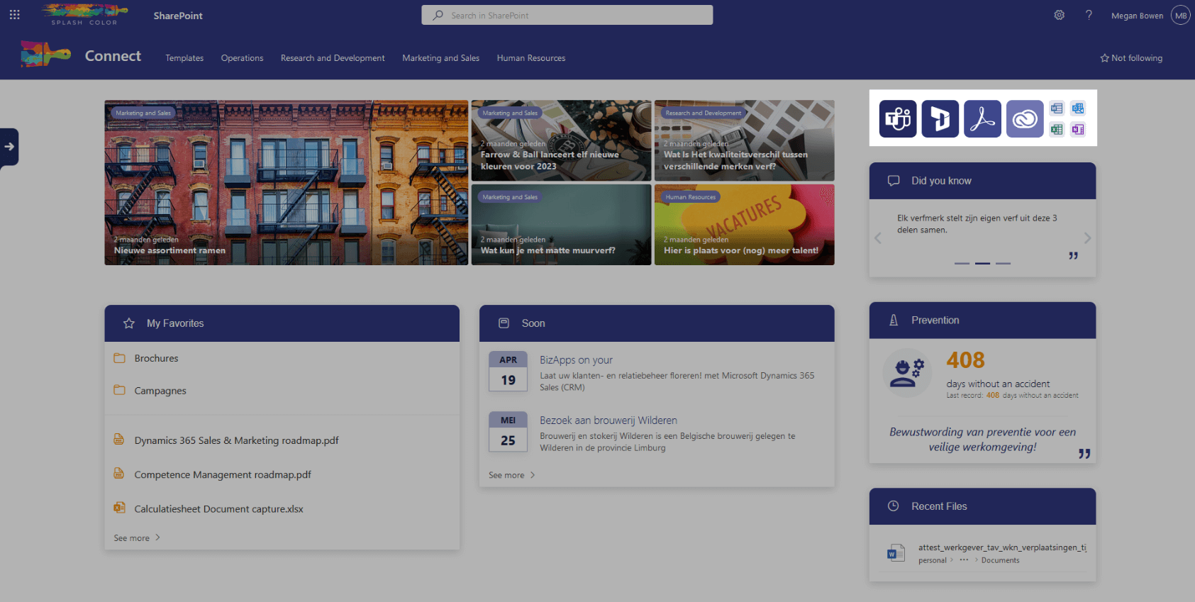
By configuring the icon, title, and location of each link, the webpart presents a clean and organized grid pattern that is easy to navigate. With the ability to choose the size of the icon, you can easily prioritize the most important applications.
This webpart saves time and enhances productivity by eliminating the need to search for frequently used applications.
Architecture
The Quick Links webpart is lightweight and highly customizable in SharePoint. Unlike other webparts, the Quick Links webpart doesn't store anything in a SharePoint list. Instead, it stores all of its configurations and data within its properties.
This unique approach allows for unparalleled flexibility and makes it easy to have a unique Quick Links webpart on each page. You can configure the webpart's alignment, whether it should be centered left, right, or center, as well as whether it should be centered at the top, bottom, or middle of the page.
Additionally, the Quick Links webpart allows you to configure the appearance of each link, including the icon, title, location, and icon size. All of the links are displayed in a clean grid pattern that is easy to navigate, making it the perfect choice for displaying links to frequently used applications or resources on your SharePoint site.
Configuration options
Manage your shortcuts
This is a list where you can add all the shortcuts you need. You can configure for each item the Name, Icon, Link, Open in new tab, Small icon, and Small icon color. You can also order all the items.
Customize the styling
Choose the direction
Choose in which direction the grid should start. The options are Row and Column.
If you choose column, you'll also need to choose what the max. amount of rows should be.
Choose the alignment
Choose how the grid should be aligned. The options are Left, Center, or right.